Friday 16 December 2011

Evaluation Question Seven

Looking back at your preliminary task what do you feel you have learnt in the progression from that to your full product?
I have learnt a lot about the media industry during the construction of my magazine. I have learnt about the level of work that goes into making a music magazine and I have learnt that different camera angles can give off different vibes. For example if the model appears uncomfortable in the photograph it makes the product appear uncomfortable and unwelcoming which will not attract an audience. I have learnt that photography is an essential part of creating a music magazine and that it is ‘key’ to building up the tone of the magazine. For example black and white photographs give more of an edge to magazines than colour photographs. I have learnt that you must experiment with photographs in different filters to discover which one works best for the tone you are trying to create. I have also learnt that the facial expressions of the models used in the photographs must be friendly and invitational otherwise it puts the reader off wanting to look at your magazine. Body posture has the same effect; if the model has negative posture the reader will more than likely not want to read the text.
The layout is just as important. If a text is set out in a complicated or messy way it puts the reader off therefore it is essential that the layout of a media text is clear and easy to follow. This links in with the use of fonts; if the font in a text is hard to read the chances are that the target audience will not bother to read it and will opt for something more appealing to the eye. Fonts like “Arial”, “Tahoma” and “Calibri” are good to use as they are used by a number of different media texts already meaning that they are easily recognisable. If something appears familiar people will feel more comfortable reading it. For example, the majority of society have a profile on Facebook which uses “Tahoma” so if a media text online was to use the same font the chances are that more people would read it because it would already feel familiar to them.
I went through many different stages during the construction of my media product and received constructive criticism from my peers (see blog post on feedback from my class). This criticism has helped me to shape my product to suit the preferred specifications of those who fall into my target audience age group. I have also progressed through my research into numerous different music magazines as I gained a wider technical vocabulary that I was able to incorporate into my own article.

Evaluation Question Six

What have you learnt about the technologies from the process of constructing this product?
When I began the creation of my media product I had no idea how to use a number of different software on the computer. I knew how to use the social networking site http://www.facebook.com/ and used it to contact people to ask if they would be willing to help out by posing as models. I then had to learn how to use the online blog site, www.blogger.com. Luckily this was quite straightforward and I soon picked it up. However other programs such as Adobe Photoshop took a lot of getting used to. This was the first time I had anything to do with Photoshop and I remember feeling very disheartened at the beginning. I didn’t know the first thing about it and was worried that I would be unable to complete constructing my magazine. However after numerous hours of practise I began to slowly get the hang of it. I wouldn’t say I was very good with it now but I am able to persevere with it and eventually get the result I want. In order to evaluate my media product in a more interesting way I had to learn how to use websites such as www.animoto.com, www.prezi.com and www.flickr.com. Through the creation of my preliminary task I also learnt a great deal more about how to create things on Microsoft Publisher. The most useful technologies that I used turned out to Adobe Photoshop and www.blogger.com. Photoshop was extremely useful as I was able to edit my photographs and make them look as professional as possible. I was also able to experiment with the layout of my magazine in a quick way. By creating different layers I was able to hide and show different things as I wished in my journey to create the best music magazine that I possibly could. The use of www.blogger.com was also very useful because it allowed me to express my inspirational ideas in a more modern manner than simply writing them in an essay, and gave me the freedom to express myself in a more creative way. It also helped me reach out to a wider audience as people around the globe will be able to access my blogger page and view my creative journey.


Evaluation Question Five

How did you attract/address your audience?

The above link will take you to my Flickr page. I have uploaded some images to highlight how I attracted or addressed my audience.

Evaluation Question Four

Who would be the audience for your media product?


Profile of someone who may be read DRUMS:
NAME – Molly Stevenson
AGE – 18
EDUCATION – University of Sunderland
INTERESTS – Socialising with friends, listening to music, shopping, experimenting with new styles.
SPENDS MONEY ON – Music, clothes, hair dye, piercings, tattoos, alcohol/nights out.
FAVOURITE GENRE OF MUSIC – Indie/Alternative
LIFESTYLE – Typical life of a student – care-free, partying, drinking, seeing friends but also hard working on University work.
LIKELY TO SHOP – Mixture of places. Anywhere from Primark to Topshop but also in vintage shops.
FAVOURITE TV PROGRAMME – The Inbetweeners, Downtown Abbey, Misfits, Skins.
WHY WOULD THEY BUY DRUMS – The plain, simple layout appeals to them, the black and white image on the front cover is different to most magazines as they are in colour, eye-catching.

Evaluation Question Three

What kind of media institution might distribute your media product and why?
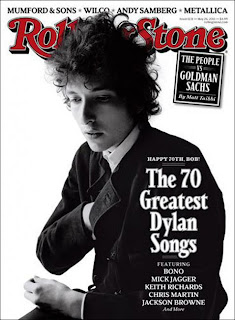
After researching a variety of different music magazines I have come to the conclusion that my magazine is most like the “Rolling Stones” magazine. The co-founder and publisher of the bi-weekly magazine, Jann Wenner (http://www.jannswenner.com/), is also the owner of “Us Weekly” and “Men’s Journal”. The political and music based magazine is based in the US and underwent changes to it’s layout in the 1990’s to appeal to a younger audience.

Before conducting my research into music magazines I wasn’t very aware of this particular one. I thought that it was a magazine that only came out a couple of times a year for fans to remember The Rolling Stones by. However I have discovered that I was wrong and that the magazine does in fact come out twice a month and covers a variety of different musical genres, predominantly Indie/Alternative bands. Perhaps I was unaware of the true nature of the magazine because I have come to realise that it is only widely available for purchase in supermarkets like “ASDA” and chain-stores like “WH Smith”. I usually buy my magazines from smaller stores such as newsagents and have never seen it in any place like that. Maybe this is because the magazine company is based in the US and is only slowly growing in recognition in the UK. Perhaps when it’s popularity in England has grown some more it will be easier to purchase here? Saying this, however, the website (http://www.rollingstone.com/) is packed full of things to read and is easy to access in the UK. This could be an indication of the changing popularity in media institutions – the internet is growing in popularity while paper copies of the information are reducing.


I think that this issue of “Rolling Stones” magazine is extremely similar to my music magazine. Both my magazine and this one have quite a plain and simple front cover with an image in black and white. They both have sell lines written on the sleeve of the model. This could be an indication that the audience of “Rolling Stone” magazine would also like mine. Perhaps if my magazine were to become professionally published I would only allow have it readily available in large chain stores so that more people would see the masthead and become familiar with it. I would hope that this would help to slowly build up people’s recognition so that eventually the audience for my magazine would grow higher and higher. I would also have a website where people could subscribe and get my magazine delivered to their homes. I would include the same information on the website but I would keep some articles exclusive to those who had registered as a means of maintaining a steady income.


Evaluation Question Two

How does your media product represent particular social groups?
The postures of both women are similar in the sense that they are both facing the camera. They share similar facial expressions too. They are wearing similar make-up and are both aiming for a beauty shot. Elle has less elaborate eyeliner than Amy and has opted for a hairstyle with loose waves where Amy has gone with her trademark ‘bee-hive’ hairstyle and a bow. Where NME chose to shoot Amy Winehouse’s body from the side I chose to shoot Elle Garcia more face-forward to make it different. I liked the costume that Elle was wearing and wanted to show it off in the image. Both women are wearing casual clothing. Elle has gone for a floral top and cardigan whereas Amy is wearing a t-shirt with a transfer on in the same style as her tattoo. Elle’s main accessory is an oversized ring worn on her right hand but Amy’s is her tattoo. This could be interpreted as Amy living up to her ‘wild girl’ image and Elle being a little less wild and more approachable. This could show their different beliefs and values – Amy values tattoos highly as an individual way of expressing herself but Elle values her accessories just as highly. By being able to change her jewellery and accessories she is able to provide her audience with a visual symbol of her mood. The background in both images is plain with the big difference being that Amy Winehouse is photographed in front of a black screen whereas Elle is photographed in front of a white wall. This could be another indication as to the difference in personality: Amy’s image comes across as pretty and wild while Elle’s comes across as more innocent. Overall I think that both of these images represent a normal young social group because they wear casual, everyday clothing that everyone can adopt to suit their own style. By dressing in the same way as the majority of young people it may be an indication of them being approachable as if they didn’t appear easy-going and friendly their music wouldn’t sell.


Evaluation Question One

In what ways does your media product use, develop or challenge forms and conventions of real media products?
The above image is a collage I created to provide a brief overview of the tone of the magazine that I made. Before I started I researched into numerous different genres of music magazines and attempted to incorporate elements of them into my own. I eventually decided on an Indie/Alternative genre therefore I decided to name my magazine “DRUMS”, as it is simple and easily remembered. I also used that particular word to hint at the field of music that would be included in it. For example, if I wanted to create a Popular music magazine I would have thought of something a little more mainstream and if it were a Folk music magazine I would have tried to relate the masthead to the genre. Also, my masthead has a similar font to magazines such as “NME” and has a similar colour scheme to the magazine “Q”. I did this on purpose to try and make it look more like a realistic music magazine. A picture that I included on my contents page was of someone in a recording studio. The model is standing by a microphone and has headphones on. There are also some amplifiers in the background adding to the mise-en-scene. The use of these adds to the impact of my magazine being about music as they make it appear more realistic. The costumes that my models wore were quite simple as I wanted to make them look like normal people to add friendliness and hopefully the make magazine look like an interesting read. As I chose to give my magazine a genre of Indie/Alternative I tried to use models that have originality to their style. My main model who posed as “Elle Garcia” has her own unique style of dressing and tends to shop at vintage shops to get one-of-kind garments that are different to the mainstream fashion stores. Another way that I attempted to make my magazine appear like a real magazine is through using technical vocabulary such as “verse”, “vocals” and “album” which all have the connotations of music attached to them. By using descriptive phrases like “ghostly image” and “haunting voice” I tried to subtly hint at the audience of the kind of music featured in my magazine.